How can we shift the role of trainers in a training module?
I run a fellowship in Pakistan for low-income students. We teach them something technical, like how to code OR be a graphic designer, and many non-technical essential skills — self-management and leadership — to allow them to be leaders in their local communities. They meet for 2 months in person in a cohort of 30 students from 9 to 5. So far, we have received very positive feedback from our students on how it has helped change their lives. My dream is to scale this, however, there is a problem — the current model is very trainer-centered.
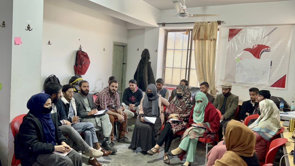
My students and I in Abbottabad, Pakistan — in a “design your life” session.
For PCE, I wanted to remove the need for a human trainer so that we can understand how to scale this. Trainers are central to this work — they are in person, setting the pace, and helping guide students by delivering in-person lessons and assessments. For PCE, I designed one of the most popular modules (on landing a job i.e. building a resume, doing interviews, etc.) — into a self-paced course.
I used Genial.ly to build out the content and hosted it on Webflow. At the day’s end, my hope is that this serves as a place for students to learn at their own pace, and meet once a week for an online gathering of learning.
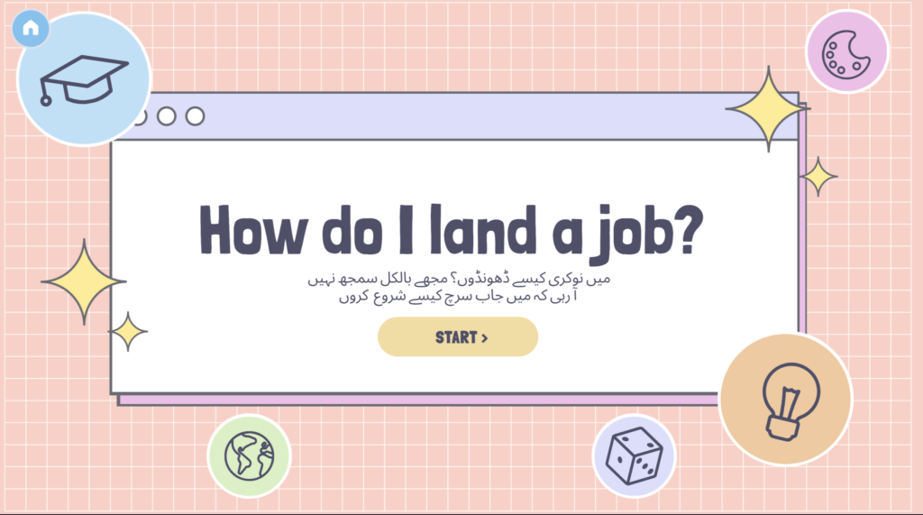
The Urdu at the bottom is an intentional design choice — several of my students struggle with English.
While building out my modules, I was surprised by how learning design has several microdecisions that surface in the process of making. I was surprised at little things, such as where I placed the start button, where I placed the home button and the Urdu translation impacted what my learners were able to get out of a module. I had to decide, for example, what professions to highlight when I was sharing information about the kinds of jobs that exist in the world. I ended up picking the ones that have the most openings in my hometown and the biggest cities in Pakistan).
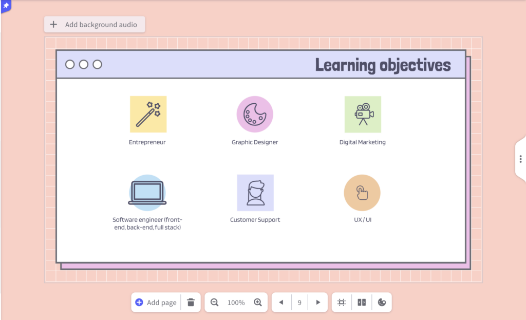
There may be universal learning design underpinnings, but I found it impossible to create a design that is universal itself. Defining the “flow” of learning was fun. While I expected to categorize the “syllabus” of the website into learning objectives, activities, and content that helps achieve those learning objectives, I did not expect to see how my “flow” and “pace” varied from student to student. What I mean by this is that while some of my students were interested in learning skills first and resume second, others wanted to first understand a picture of the landscape i.e. know what jobs exist out there, so that they can have something to yearn for, and gain an awareness of what exists out there. It was difficult to factor this in; I catered to this by allowing my students to pick their own adventures. Hence, each one of the headings in the “content section” below is clickable.

They can click on any of the sessions above; there is no strict starting or ending point, though I made my suggestions clear by indicating an introduction and a closure.
In the process, I also realized the value of avoiding cognitive overload. In HPL, we learned that if introduce many new ideas while setting a challenge for our students, for example, getting them to both use a new method of submitting homework and creating the task such that it challenges them, our learners may feel defeated. I made sure to simplify forms and made quizzes quite simple. A simple hover over the options helped my students see what concepts they had wrong. This helped them use their cognitive resources towards thinking through the options, rather than figuring out how to use the interface.
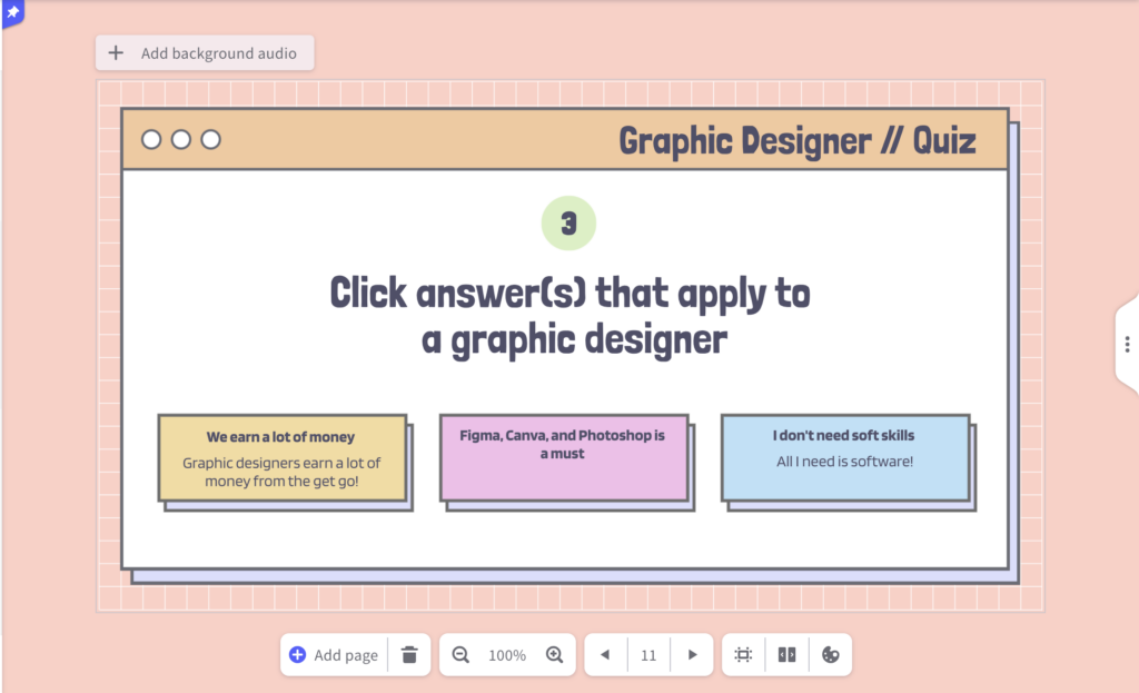
This module is intentionally designed to test students; each time they click a box, a popup opens to show whether they are right or wrong.
Another piece of realization is that the tool we use can be very empowering or disempowering. I started by using Webflow, and I realized, I created a “cognitive overload” for myself; I was not interested in making a website really, I just wanted to create something — an interactive tangible interface — for my students to learn in. Using Webflow for this particular project made me feel disempowered, as I realized I needed to purchase a plan to be able to make it truly like I had imagined in my wireframe. Instead, I used Webflow just to “host” the modules and make them clickable; the actual learning modules live on Genial.ly, which is a much easier-to-navigate tool. Its existing templates were a great start for me to tweak and create my own, and the ability to add interactive elements made it work like a website.
After sharing the modules with a few of my students, I am happy to share that they find it useful, and are working with me closely in designing it. That is my final piece of realization — that learning design is about iterating with others and building with those whose lives I want to impact. Every week, I interact with my students and hear their thoughts on what I am designing that is useful, and what I am doing that could be made more useful for them.
I am still building out my modules, and understanding how I can infuse the element of deep care into the learning process; I showed up for my students every day, but I do not know how we can scale the model of care.
If you are curious to learn or hear more, reach out to me! My Whatsapp is +1 415 656 8259, my email is ezza_naveed@gse.harvard.edu, and Linkedin is https://www.linkedin.com/in/enaveed/.